Micro Forces: Designing Beyond The Trend Cycle
Why the most impactful packaging draws power from deeper cultural and consumer shifts.
We originally wrote this piece for DIELINE, published October 15, 2025. Micro Forces inform just about everything in branding, even design. They’re the glue between strategy and execution.
What makes something stick?
Every few months, our feeds fill up with the next big thing in design. A new color palette, a font revival, a viral aesthetic that briefly convinces brands to reimagine themselves. And just as quickly, it goes away—another casualty of the algorithm’s appetite for what’s new and next.
But beneath the churn, there’s something stickier. More powerful. We call them Micro Forces.
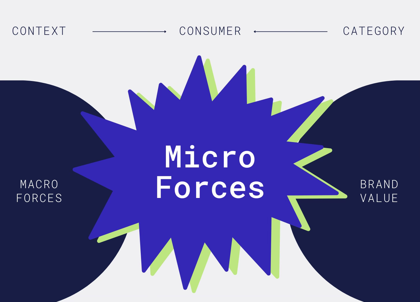
Micro Forces have a traceable history and foreseeable future. They are lasting and, often, category-agnostic drivers of consumer attention and interest because they answer the persistent and widespread human needs that arise in response to our changing world. They’re not fleeting aesthetics but the deeper, connecting currents of culture, commerce, and creativity. They shape how things look, yes, but also why they matter. For designers and brand builders, this distinction matters. The best packaging and product design aligns creativity with cultural momentum, turning products into something people don’t just buy but buy into.
Think about it this way: Micro Forces help brands translate big, squishy Macro Forces like digital overload and climate anxiety to category and brand-specific positioning pathways (innovations, names, messaging, and design). They’re where and how contextual and category factors converge to deliver meaningful brand value to consumers.
A perspective around Micro Forces can add real depth to the conversation about where packaging innovation is headed and likely to stick. So, here are five that we think have the richest runways:
Barely There
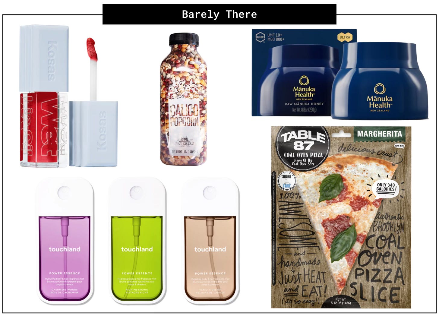
As our planet ages, the ambition of zero-waste in packaging isn’t going anywhere. It’s been about re-use and recyclability (still essential) for decades. Then came the era of packaging that was so beautiful and stylish that it earned its right to exist (Diaspora Co., Marvis, Compartes). Now comes the era of Barely There packaging— something so seamlessly integrated with the product you barely notice its presence. This Micro Force lets products shine, even in categories like pantry, frozen, and beauty, where packaging is essential for product integrity and safety. It signals pride in product aesthetics and quality—an eternal ambition of many brands—and alleviates consumer skepticism and guilt over purchases with a lot of excess. Just don’t confuse this Micro Force with all-out design restraint. It’s anything but, invoking some of the furthest reaches of creativity to make packaging with purpose feel invisible.
Borrowed Equity
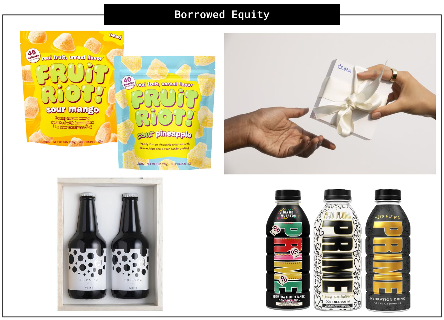
Forget category codes. Borrowed Equity happens when packaging raids another world’s visual language—think streetwear, luxury goods, and sweet indulgences—and brings its swagger somewhere unexpected to create an instant shortcut to relevance. As consumers, we rely on packaging to protect and explain the product, but also to cue occasion, justify price, and, in the case of Prime Hydration’s “Street Drop” collection, elevate or accessorize an image. Borrowed Equity exists to deliver on these more contextual and comparative needs. As the pace of innovation is constantly reaching new heights, so is our reliance on visual “is this for me?” shortcuts. You can eyeroll away, but Fruit Riot is bringing candy cues to frozen cuts of mango and pineapple, and let’s just say, “Yes, your kids can be fooled!”
Everyday Stagecraft
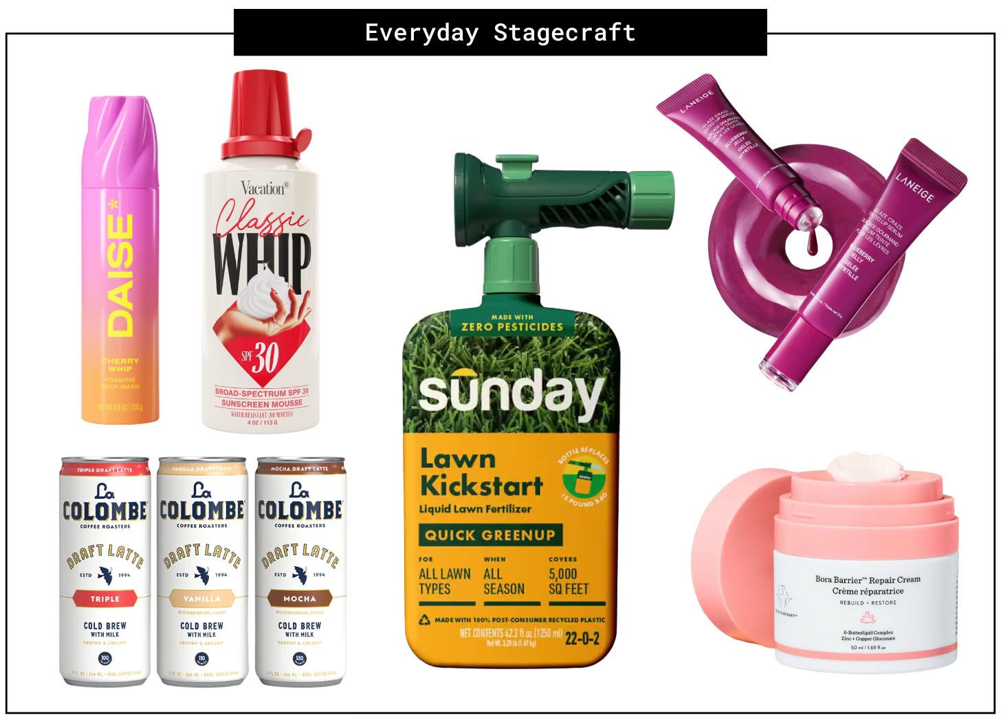
“Fun” used to be a thing that just existed in kid-centric packaging, but it’s increasingly showing up in adult categories too. Caution: adults’ gimmick guard is slightly more sensitive than L.O.L. Surprise! lovin’ littles. Hence, the flair, fun, and “pffft-hissssss” (ala La Colombe Draft) showing up in adult-focused packaging innovations today rightly serve a deeper, use-inspiring purpose. Fans claim “something addicting” about the whipped dispensers of Daise and Vacation skincare products or the cushiony donut applicator of Laneige’s Glaze Craze lip tint. These “little things” accelerate and accentuate the emotions that people enter the category to achieve: indulgence, comfort, fragrance, and ease.
Logo-less
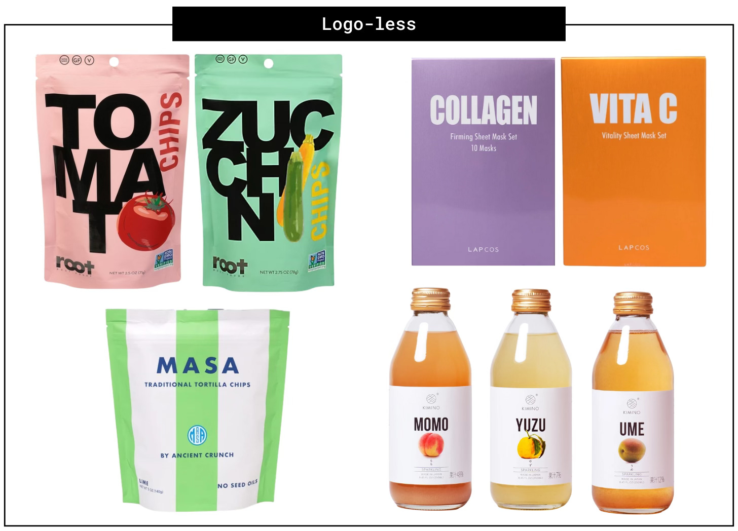
This direction is one that marketers have brought upon ourselves in partnership with our media pals. There’s no denying the ramp-up of visual stimuli in our world since the onset of the digital age, widespread adoption of smartphones, and the rapid-fire format of social media. Overstimulation is now a frequently discussed, researched, and treated human condition (just Google it and you’ll be overstimulated with the results). In response, some marketers in the most notoriously loud and noisy categories (beauty, snacks, and beverages) stand out by holding back. Instead, they’re foregoing the traditional BIG logo to elevate a single ingredient or attribute. It reads like a humble move for the sake of consumers’ sanity, and hits like a declaration of supremacy in delivering what people want. Keep in mind, Logo-less does not mean brand-less. Brands shaping this Micro Force lean heavily on other levers of brand identity—pattern, font, graphics, color, and layout—to establish clear and resonant calling cards.
Pseudo-ceutical
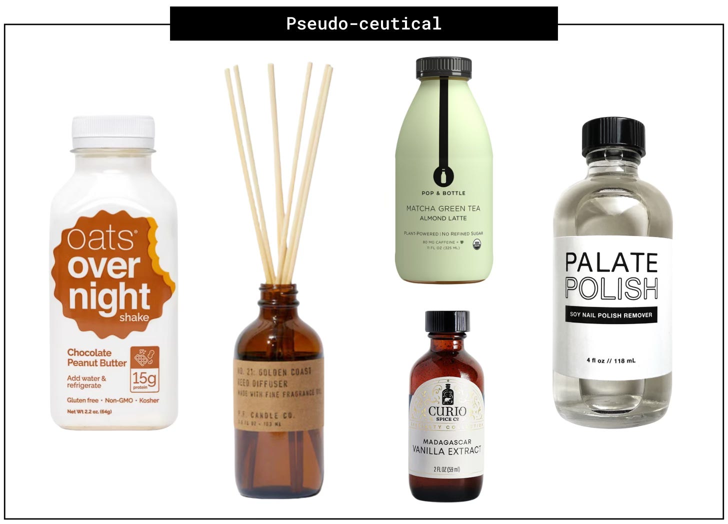
Taking design cues from pharma and medicinal lore has long been a thing in beauty and skincare package design (from C.O. Bigelow to Ordinary), but now we’re increasingly seeing it in food, beverage, and home goods — anywhere people want to achieve a “prescription-level” degree of transformation. Our ever-expanding wellness culture fuels this Micro Force—both in who it consumes and how— as well as the democratization of for-real pharma (GLP-1s and statins) and pharma-adjacent substances and regimes (CBD, THC, micro-dosing, aromatherapy, and creatine-loading). There’s no turning back from a consumer culture obsessed with control and winning at life, no matter the degree of self-study and discipline it takes. Pseudo-ceutical design reinforces, even rewards, this discipline by aligning with the unflashy, copy-forward aesthetic of a category that exists exclusively to better health.
Each of these Micro Forces has legs in package design and beyond. That’s the magic of knowing they exist, and why. Micro Forces reveal those subtle but powerful shifts turning everyday purchases into experiences people care about, talk about, and return to again and again. For designers, they offer a way to punch through the noise, align creativity with cultural momentum, and create packaging that catches our eye while earning a place in our lives. In a world addicted to chasing the next big thing, Micro Forces can help us spotlight the shifts that stand the test of time.


